Projects
🚀 My Projects
Explore some of the exciting projects I've worked on:
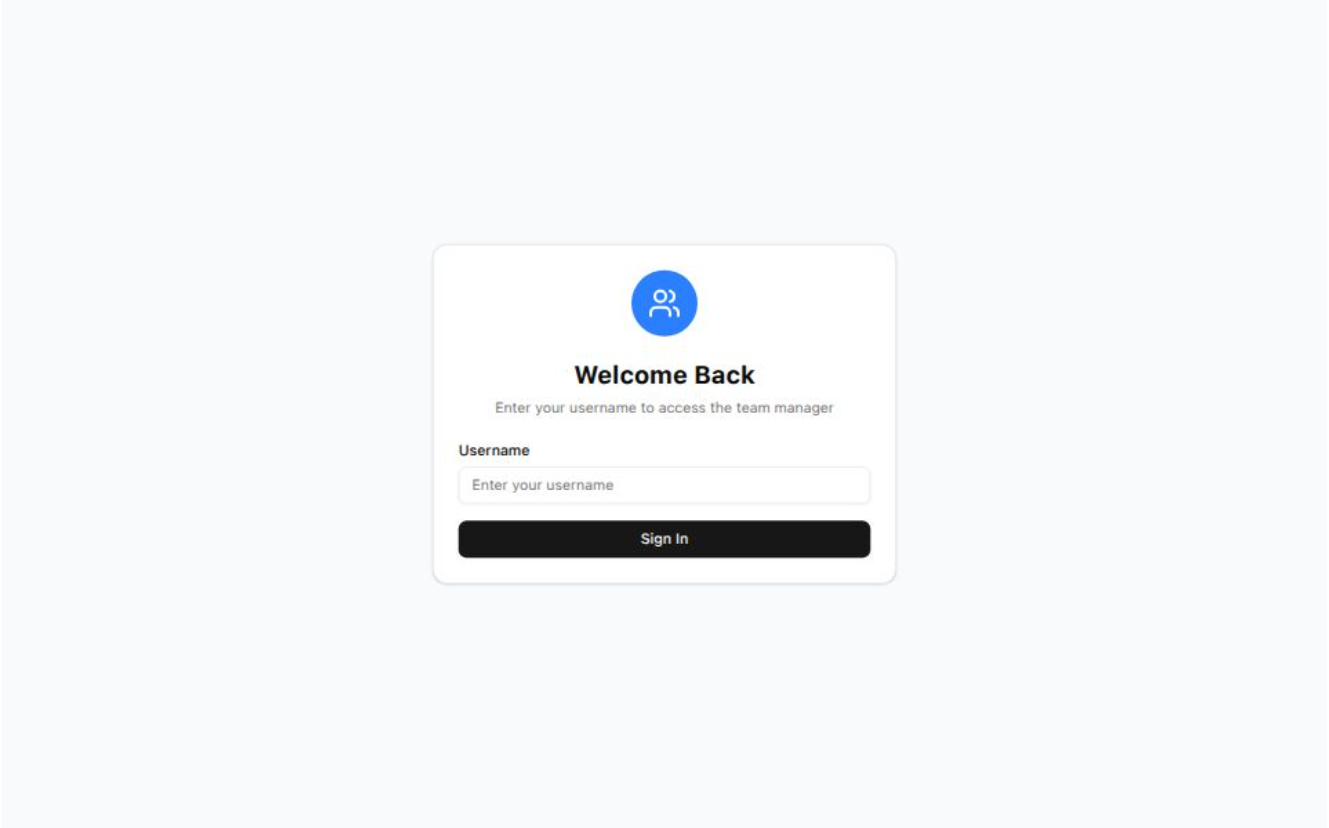
👥 Team Management App
Click here to view the project
📝 Description
Team Management App is a robust and user-friendly team management tool built with Next.js, Tailwind CSS, and shadcn/ui. It enables seamless CRUD operations, intuitive modal interfaces, and efficient global state handling using Context API—all within a clean, modern design.
🌟 Key Features
- ➕ Create, update, and delete team members with ease
- ♾️ Infinite loading for seamless pagination and performance
- 🧠 Context API for global state management
- 🪟 Modal popups with
shadcn/uifor smooth UX - 🎨 Responsive design powered by Tailwind CSS
- ⚡ Fast and scalable, built on Next.js
🎬 MovieVerse
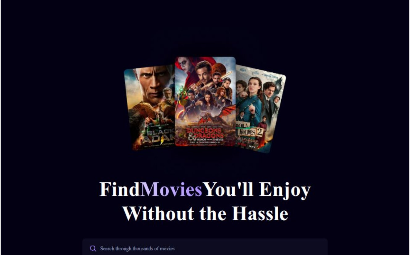
📝 Description:
MovieVerse is a fast and responsive movie app built with React, Vite, and Tailwind CSS. Users can search movies with optimized debounce, explore trending titles, and view detailed movie info—all in a clean, modern UI.
🌟 Key Features:
- 🔍 Debounced movie search
- 🔥 Trending movies display
- 🎞️ Movie detail view
- 💅 Tailwind-powered responsive design
🎮 GameHub
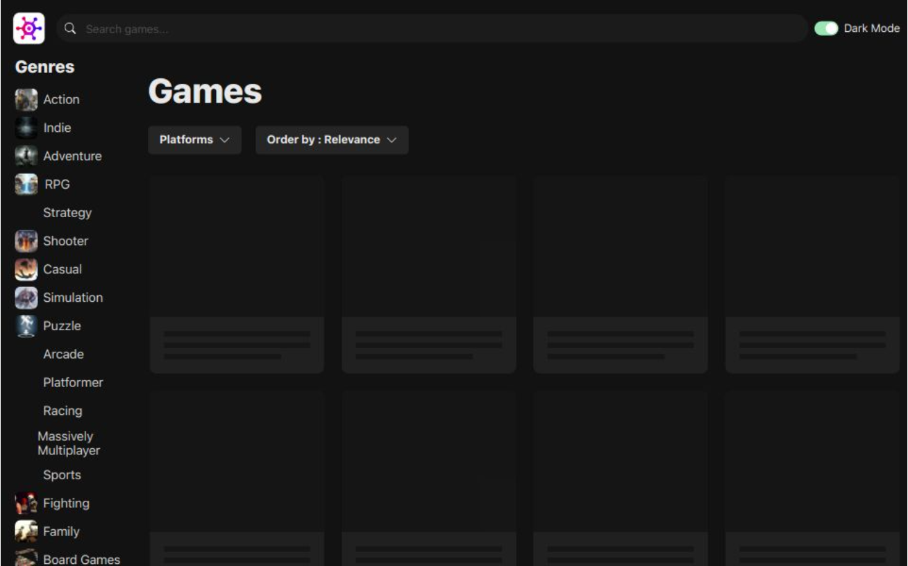
📝 Description:
GameHub is an innovative gaming platform designed to help users discover, explore, and filter through a vast collection of games. Built with Vite.js, this website provides a smooth and fast user experience, allowing players to search for their favorite games and sort them by popularity, genre, or rating. Whether you're a casual gamer or a hardcore enthusiast, GameHub is your one-stop platform to find the next game to play.
🌟 Key Features:
- 🔍 Game Search: Easily search and find games by title, genre, or platform.
- ⭐ Popular Games Filter: Sort games by popularity, trending status, or top-rated titles to find what’s hot.
- 🎮 Game Details: View in-depth information about each game, including descriptions, trailers, ratings, and user reviews.
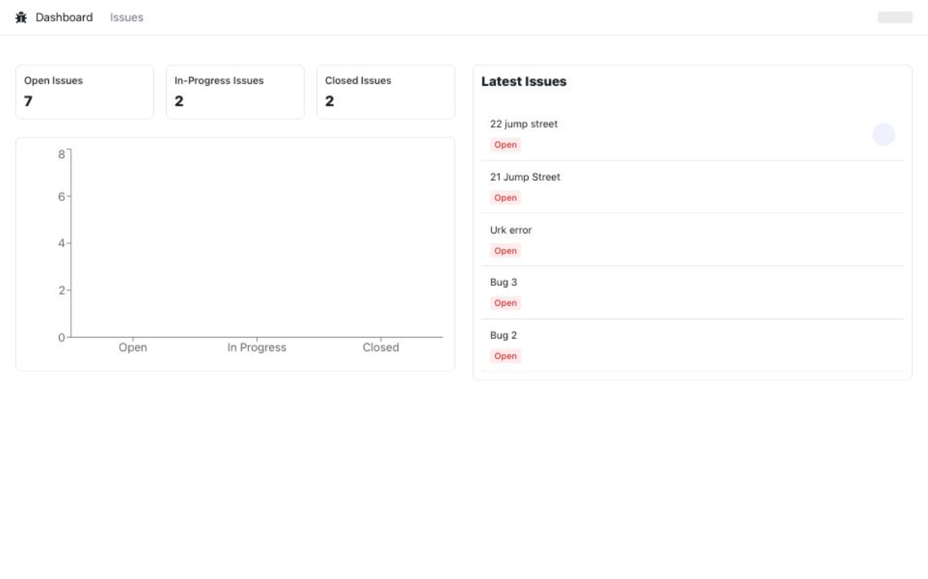
🛠️ Issue Tracker
📝 Description:
The Issue Tracker is a dynamic platform designed to streamline issue management in software development. Built with Next.js and integrated with Google OAuth, this application allows users to:
- Create Issues: Easily report bugs, tasks, or feature requests.
- Delete Issues: Remove irrelevant or resolved issues with a single click.
- Filter Issues: View issues by status, priority, assignee, and more.
- Assign Issues: Effortlessly assign issues to team members based on expertise or availability.
By leveraging Next.js for fast and scalable server-side rendering, and integrating OAuth Google Sign-In for secure user authentication, the project simplifies the development workflow, enhances team collaboration, and provides users with seamless interaction and management of their issues.
🧭 Responsive Sushi Website
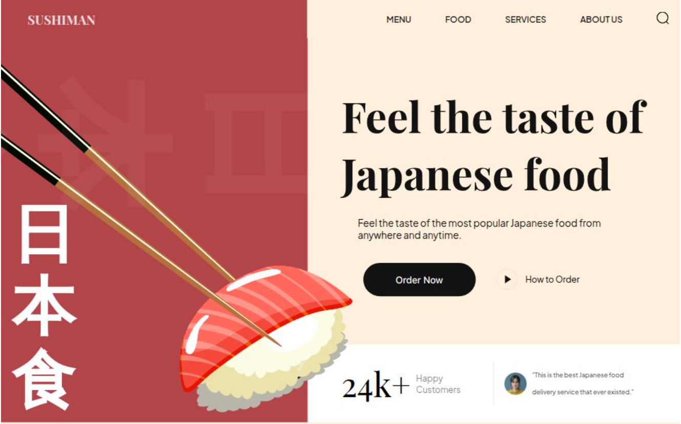
📝 Description:
The Responsive Sushi Website is a sleek and lightweight front-end project built using Vite, HTML, CSS, and JavaScript. Designed for modern restaurants or food brands, this website delivers an engaging user experience with fast load times, smooth animations, and a fully responsive layout.
Vite enables an ultra-fast development environment with instant hot module replacement (HMR), making it easy to scale or customize this project.
🌟 Key Features:
🍱 Built with Vite Leverages Vite for lightning-fast development, hot reloading, and optimized builds — ideal for modern web workflows.
📱 Responsive Layout Designed to adapt flawlessly to all screen sizes using a mobile-first CSS strategy.
🍣 Animated Navbar & Smooth UI Includes a responsive navbar with a sliding drawer menu and smooth CSS transitions for an enhanced user experience.
🧩 CSS Utility Classes Custom utility classes simplify styling for layout, spacing, typography, and color — no external frameworks required.
🎨 Modern, Minimal Aesthetic Clean design using semantic HTML5 and accessible styling principles for clarity and visual appeal.
⚡ Fast & Framework-Free No bloated frameworks — just pure HTML, CSS, and JS backed by Vite for blazing performance.
🧭 Responsive Landing Page
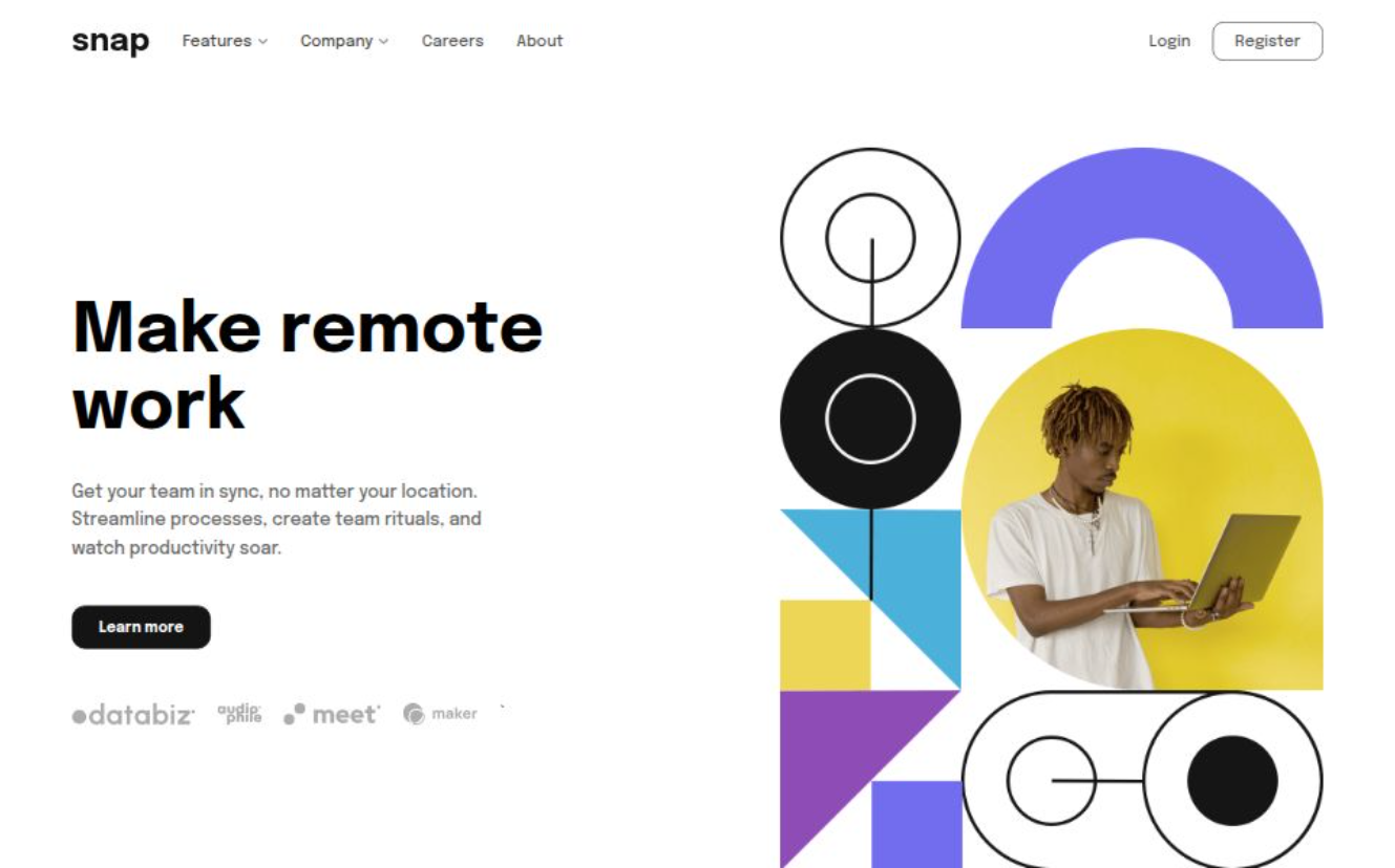
📝 Description:
The Responsive Landing Page is a sleek, modern web page designed to showcase a product or service with elegance and performance. Built using HTML, CSS, and JavaScript, it features a fully responsive navbar and hero section that adapts beautifully to all screen sizes.
This project emphasizes clean design, user experience, and responsiveness — making it a perfect foundation for startups, personal portfolios, or landing pages.
🌟 Key Features: 📱 Fully Responsive Navbar: The navbar adapts to all screen sizes and includes a mobile drawer toggle with smooth animation.
🖼️ Hero Section: A visually appealing hero block with compelling messaging and an image layout optimized for both desktop and mobile.
🎨 Modern UI: Designed with accessibility and clarity in mind, using semantic HTML and minimal CSS.
⚙️ Lightweight & Fast: No frameworks, just pure HTML/CSS/JS — built for performance and simplicity.